Tahoe Bike Co
The Challenge
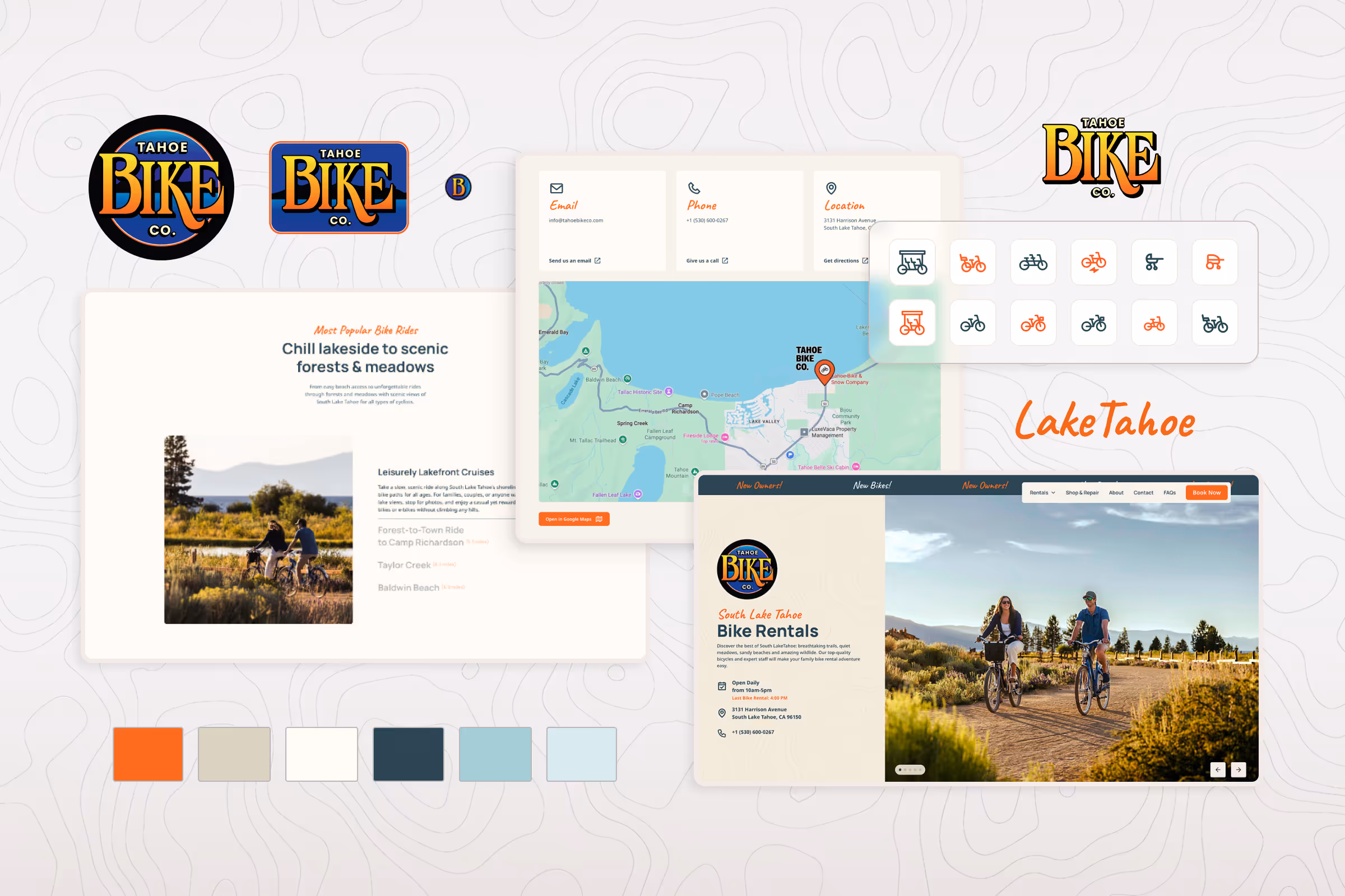
The client wanted to retain their existing logo, which already had recognition within the local community. However, the overall branding and website felt very dated and didn’t fully capture the energy of the new ownership and the natural beauty of Lake Tahoe. The challenge was to modernize the design, simplify the brand presentation, and create a more intuitive user experience, all while maintaining brand familiarity.
The Solution
I started by refining the original logo by simplifying its forms, balancing proportions, and optimizing it for digital use while preserving its recognizable essence. As part of the refresh, I recommended shortening the name from “Tahoe Bike Company” to “Tahoe Bike Co.” This subtle change made the brand name feel more modern, concise, and memorable, which makes it a better fit for both digital and physical applications.
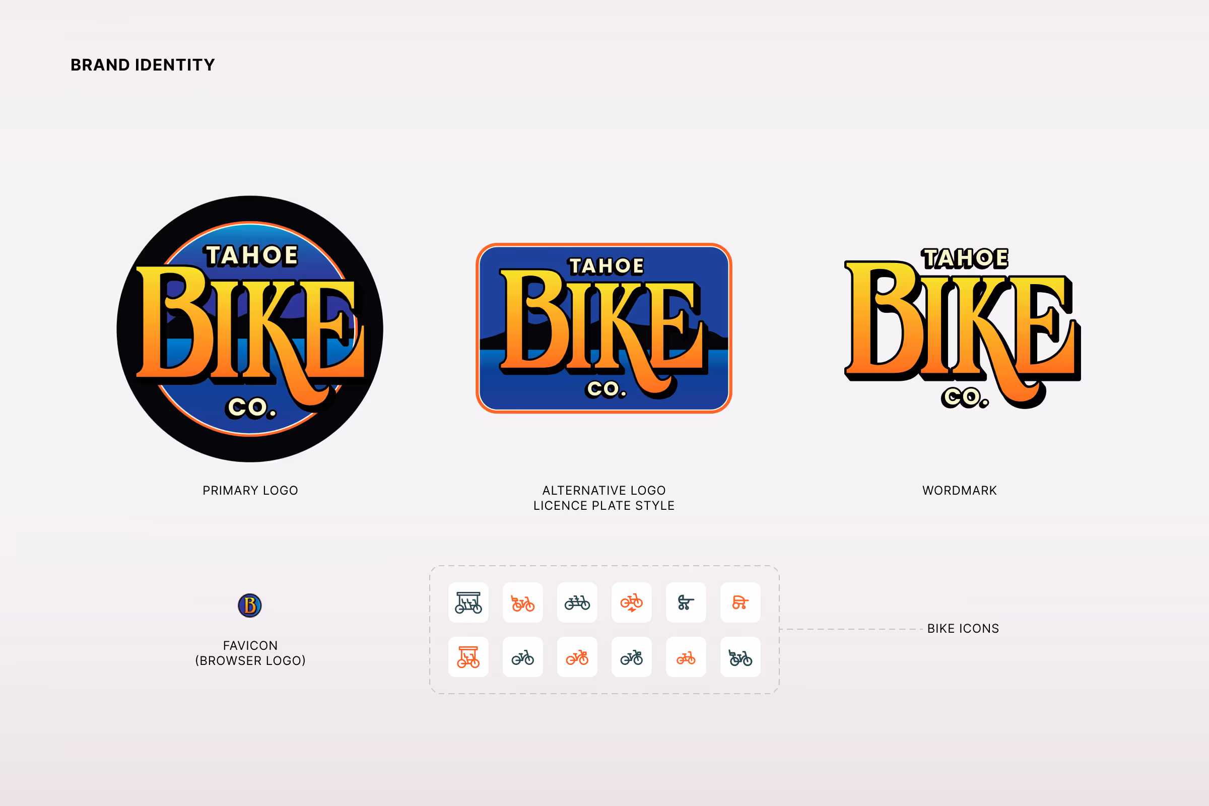
In addition to the refined primary logo, I designed an alternative version inspired by a vintage car license plate. This version adds character and a touch of local nostalgia, while offering versatility for use across signage, surrey bikes, and branded merchandise.
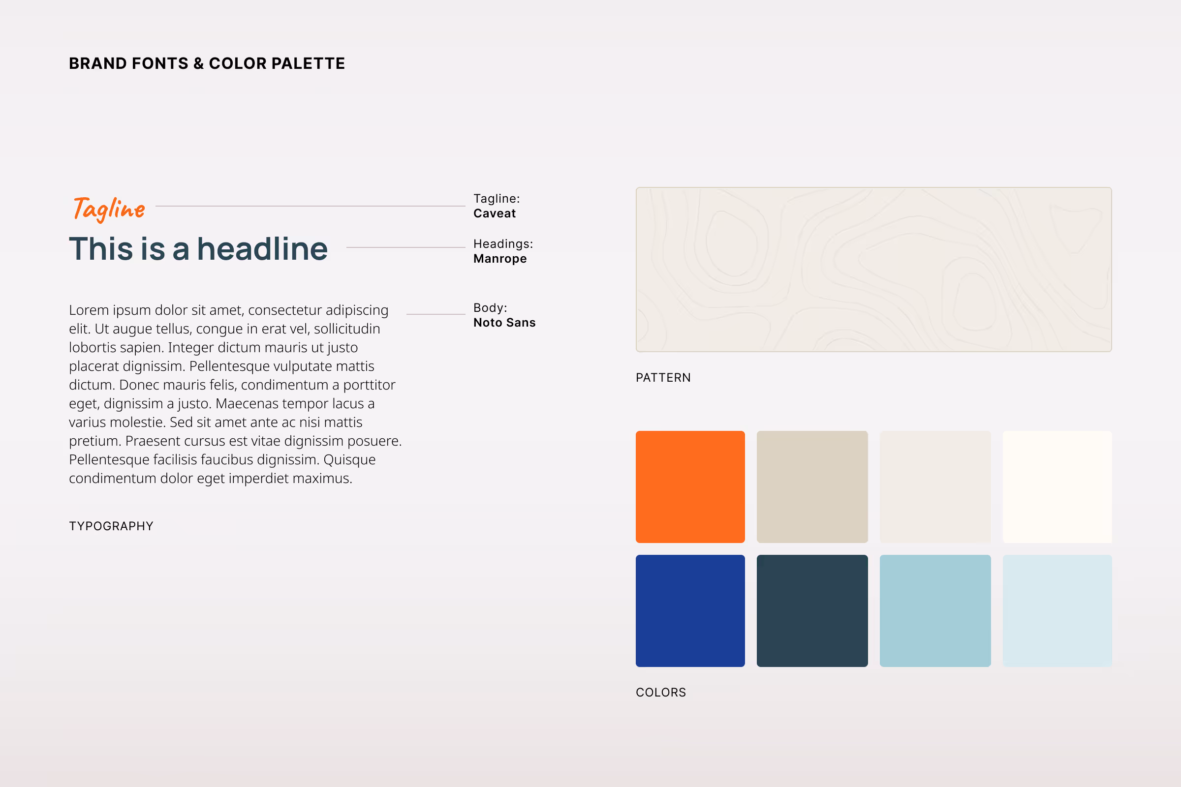
Fonts and color palette
The color palette was influenced by Tahoe’s natural surroundings:
- Deep Lake Blues — capturing the calm, clear waters of the lake.
- Warm Sand Neutrals — reflecting the golden shoreline.
- Earthy Reds and Browns — inspired by the region’s rocky terrain and red soil.
- Vibrant Orange Accent — used sparingly to draw attention to key interactions and CTAs, adding warmth and energy throughout the design.
Together, these hues create a visual identity that feels grounded, inviting, and distinctly tied to the Tahoe landscape.
The Design
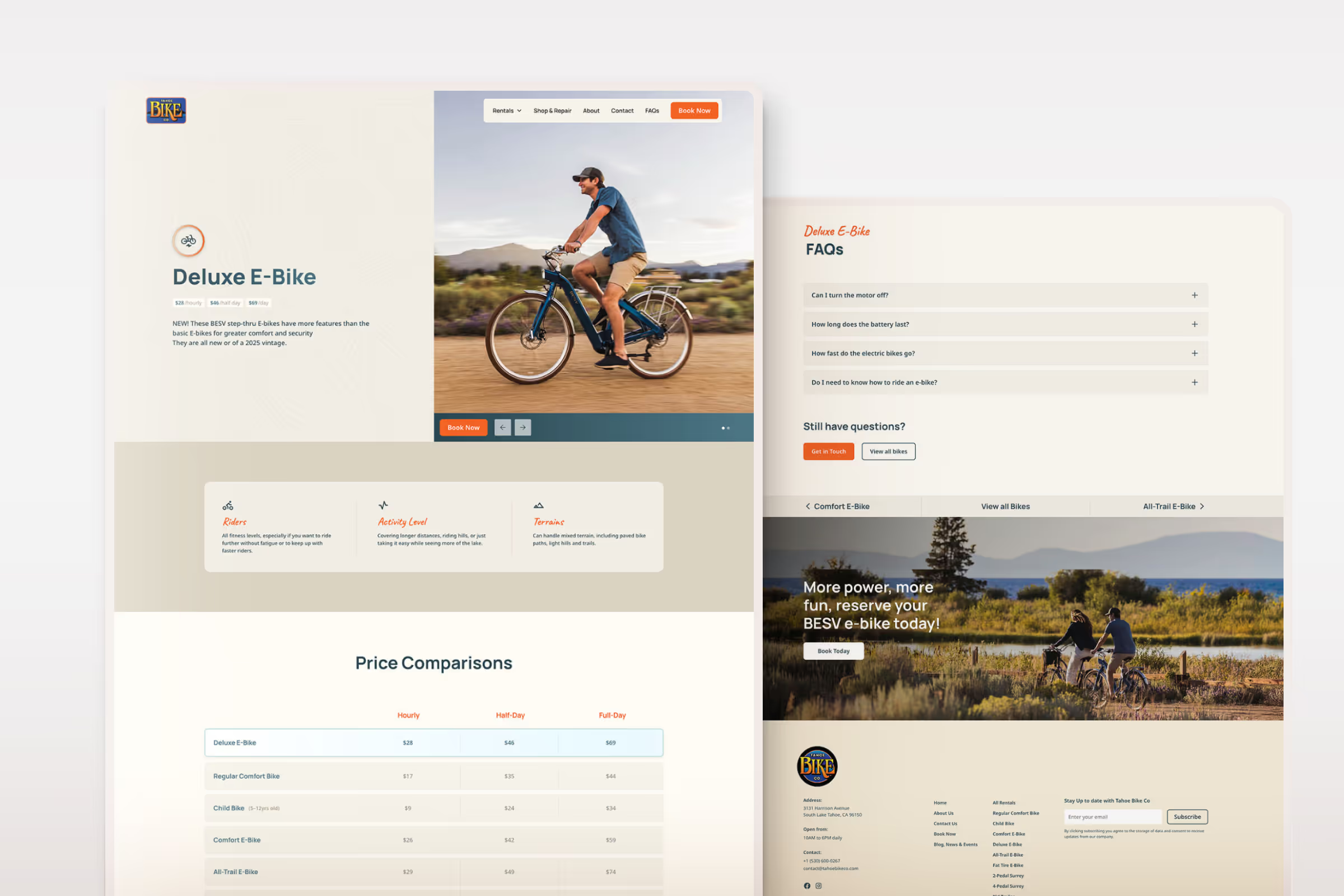
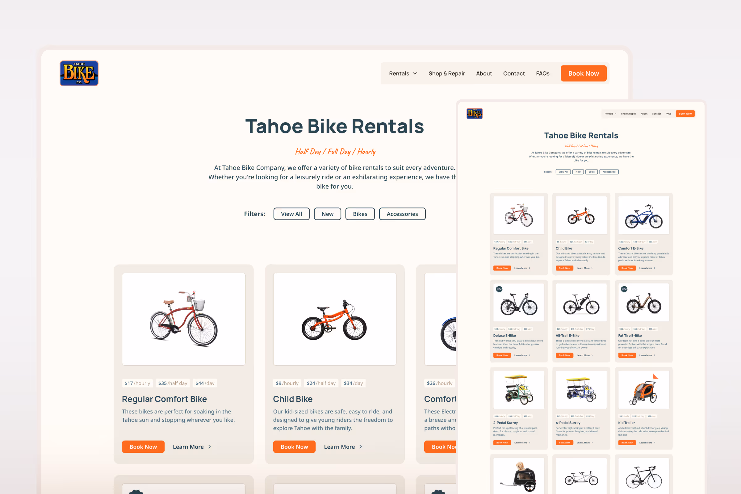
The redesigned website emphasizes clarity, simplicity, and ease of use. Visitors can quickly find key information, such as available bikes, rates, hours, and FAQs and start their rental process with minimal effort. The streamlined navigation, generous spacing, and clear visual hierarchy make for an effortless browsing experience.
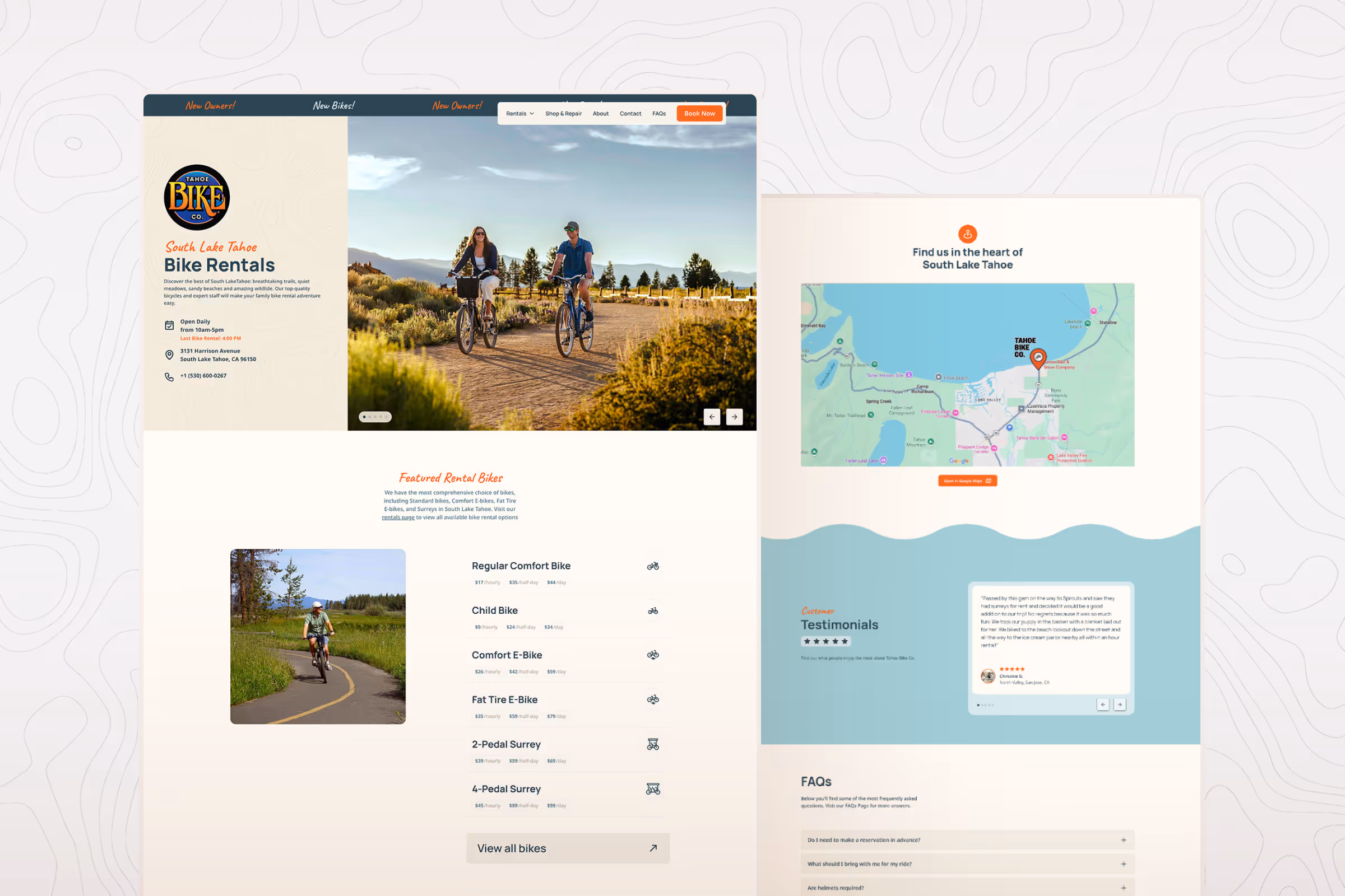
Photography and typography play key roles in shaping the look and feel. Expansive imagery captures the outdoor adventure and natural beauty of Tahoe, while clean, modern typography ensures the interface remains approachable and easy to read on all devices. The orange accent color adds a dynamic pop throughout, guiding attention to important actions like booking buttons and featured sections.

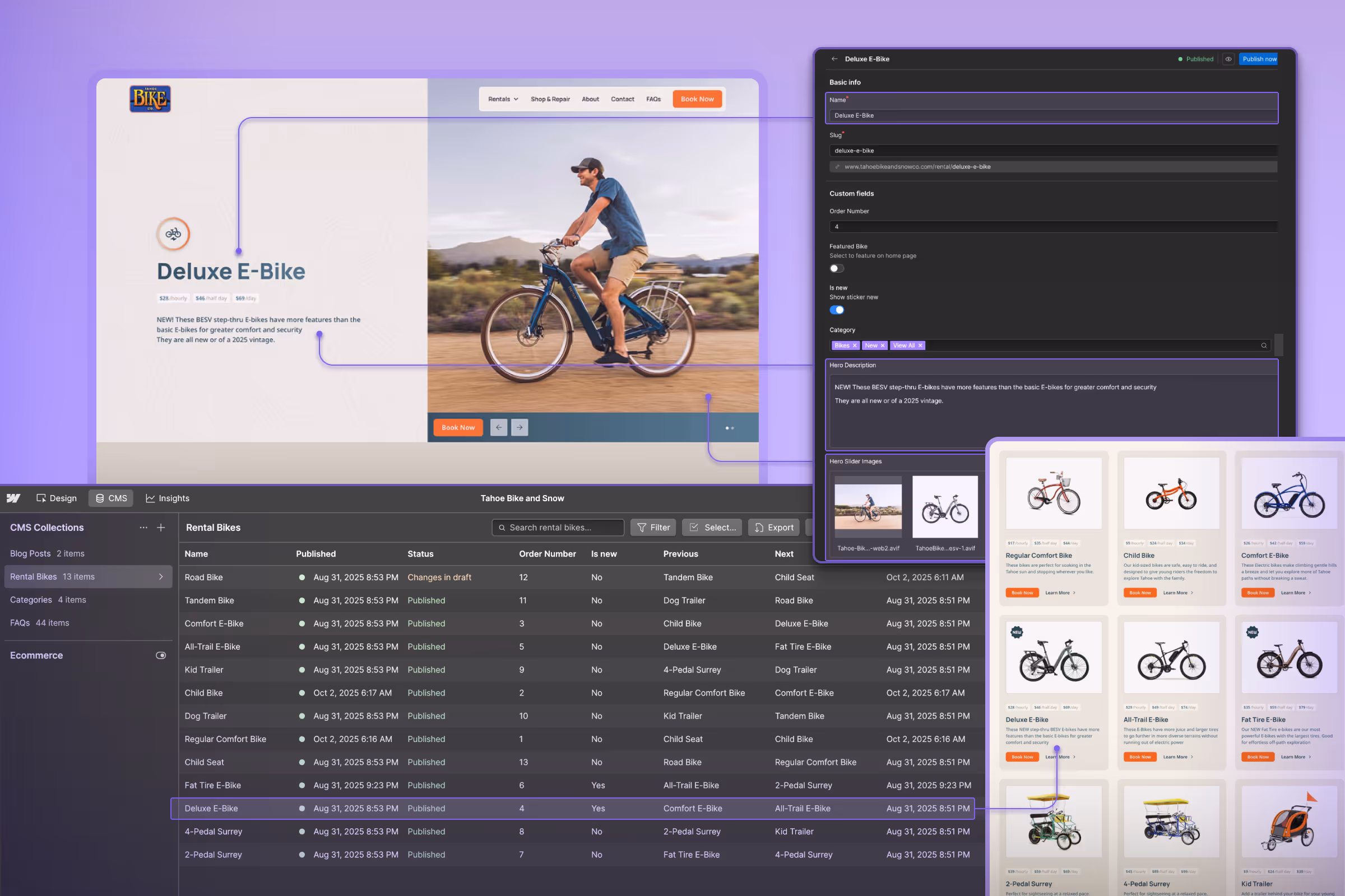
CMS Integration
To ensure long-term flexibility, I integrated a custom CMS that allows the Tahoe Bike Co team to:
- Update available rental bikes, details, and photos.
- Edit pricing, FAQs, and content independently.
- Keep the website current through seasonal and inventory changes.
This setup gives the team full control over their content, enabling them to update prices, edit titles and descriptions, or add new products, with changes reflected instantly across the entire site without needing outside support.
The Results
The refreshed Tahoe Bike Co identity and website strike the perfect balance between familiarity and freshness. The simplified name and logo system strengthen brand recognition, while the color palette and license-plate-inspired logo variation extend the identity across multiple applications. The new website improves usability, streamlines the rental process, and gives the client a modern digital presence that captures the laid-back adventure of biking around Lake Tahoe.
See it in action, visit → www.tahoebikeandsnowco.com
